

When you put on a bright orange sweater, do you feel more cheerful? When you walk into a dark room, do things suddenly feel heavier?

A recent study in the Journal of Experimental Psychology found that test takers who received a red participant number in the top corner did 20% worse on the test then their peers who received a green or black participant number. Researchers assume that the color red reminds people of failure, which increases their anxiety.
On the other hand, during the 2004 Olympics, researchers randomly assigned athletes with either blue or red equipment and protective gear. Those who received the red gear had a significant advantage over those who received the blue gear. Was that because their opponents saw the gear and felt increased anxiety? Or was it because the color red naturally makes people feel physically stronger and more energetic?

The truth is, the field of color psychology is a fledgling one, with some experts treating it with a degree of skepticism. At the same time, color definitely has an impact on how we feel, which has an impact on what we do.
So color plays a big role in psychology 一 and by extension, in marketing. Different colors call up different emotions, and tapping into those emotions can put your company at an advantage. Your brand identity will dictate which emotions you want to evoke and which emotions you want to avoid.
Case in Point: Logos
Perhaps the most obvious application in which color plays a strong role is in the design of your logo. Once you decide on your brand’s identity, you’ll want to base your logo color on that identity.
If your company focuses on selling gear to adventure travelers, a red logo might be the perfect choice. As the above studies show, red signifies action, danger, and excitement 一 all of which perfectly fit your brand.
But let’s say that your organization is a non-profit that helps women escaping domestic abuse. In that case, you’d never want to choose red for your logo. Those connotations are the opposite of what you want to convey. Instead, you’d probably lean towards using soft yellow (warmth and optimism) or light blue (trust and serenity).
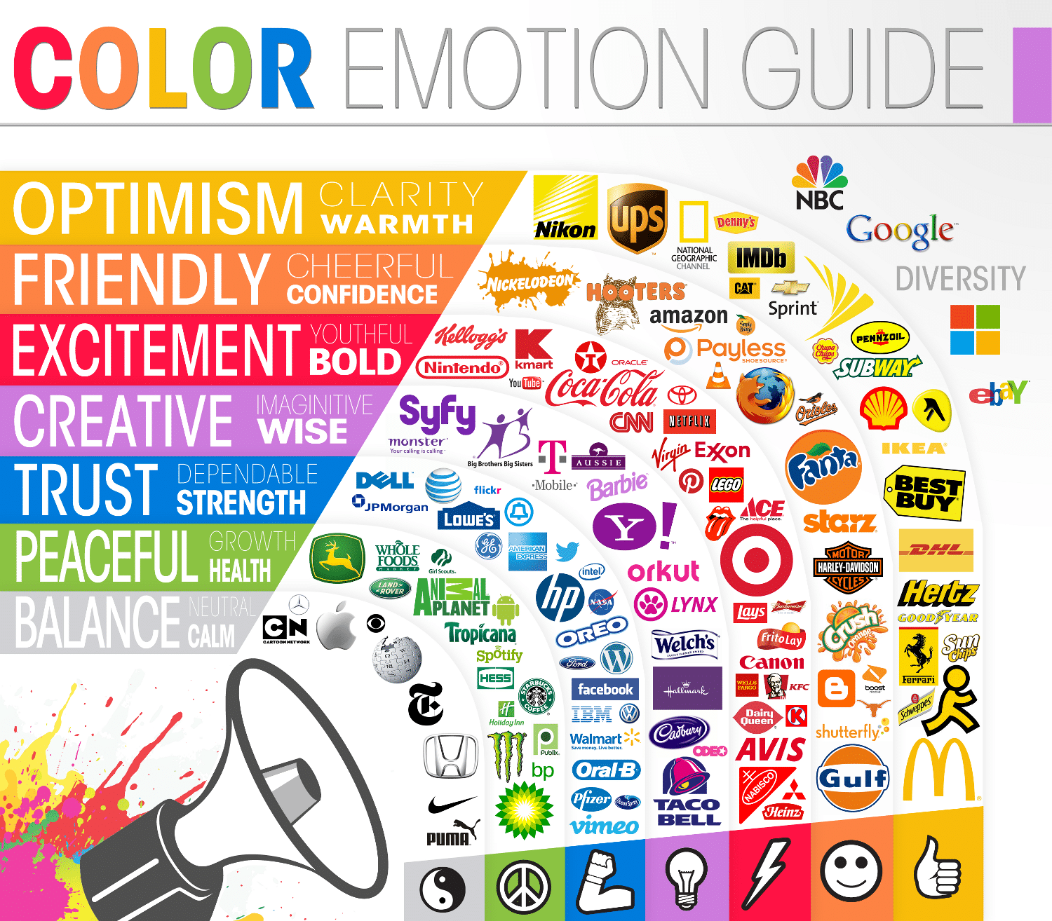
This fantastic image, created by The Logo Company, shows how many famous logos tap into the power of color when designing their logos. During the logo design process, these companies carefully selected colors that match the emotions that they want consumers to connect to their brand:
Color, color everywhere
It’s not just your logo. Color powerfully affects emotions, and it can be an effective tool in many contexts:
Packaging
What message do you want to send to consumers who see your product in-store or online? Is your product environmentally friendly? Opt for brown and green packaging. Are you selling a high-end, luxurious product? Consider packaging it in purple.

Decor
Your workplace makes a huge statement about your company. Choosing the right color scheme for your place of business can leave an indelible impression on the minds of your employees and your clients. This holds true for designing the perfect office, storefront, or even warehouse. Some colors, like pink or light blue, have been known to make people feel less aggressive or agitated. (That’s why many prisons are painted a specific shade of pink, and many hospitals have light blue walls.) Brighter paint colors, on the other hand, might make people feel more energetic or creative.
Uniforms
Your employees are the face of your company, so the color of their uniforms should match your company’s image. If your brand is young and cheerful, bright yellow uniforms might be the way to go. If your brand is associated with the outdoors, go for dull orange or green uniforms (think fall leaves or fresh spring grass). Black uniforms can go both ways. Black is classy and displays authority, but it may look menacing to some customers. In short, dress your employees carefully, choosing your color scheme just as meticulously as you would your company logo.

Accessories
Color can impact even the smallest details in your company. Looking to design your website? Plan a display for an upcoming trade show? Print some new business cards? Buy a fleet of company trucks? In all of these cases, and so much more, don’t overlook the power of color.
A Change of Time and Place
It is important to keep in mind, however, that the significance of a color can change from time period to time period, and from place to place.
For example, thirty years ago, rainbows meant “friendly,” “childish,” or “happy.” Today, rainbows are a symbol for gay pride.
Similarly, at the beginning of the technology boom, more than 50% of the top 100 tech brands chose dark colors, such as black or medium/dark blue for their logos. These dark colors connote expertise and authority, which was important to these early brands. Today, tech brands generally prefer bright blue colors, which are in the same family as their dark blue predecessors, but have a more lively feel. Take a look:

Even in the same time period, different locales have different associations with certain colors.
In Japan, France, and the US, the color purple connotes wealth, freedom, and royalty, respectively. In India, however, the color purple connotes sorrow. Probably not quite the message that your company’s marketing team would like to convey, is it?
Similarly, most Americans view pink packaging as targeting females, and blue packaging as targeting males. In Belgium, however, baby boys are generally dressed in pink, and baby girls dressed in blue. Belgian marketing needs to reflect the local norms. That’s why when it comes to international marketing, proceed with caution before assuming your color scheme will translate correctly.
 The bottom line? Color matters. Understanding the nuance that each color and shade conveys can solidify your brand identity in a big way. From logos to websites, and from the paint on your dressing room walls to the envelopes you use for your mailings, never underestimate the power of color.


