
You’ve probably seen infographics before. Here’s a beautiful example from @juliepeasleydataviz on Visual Capitalist showing countries that don’t recognize others:
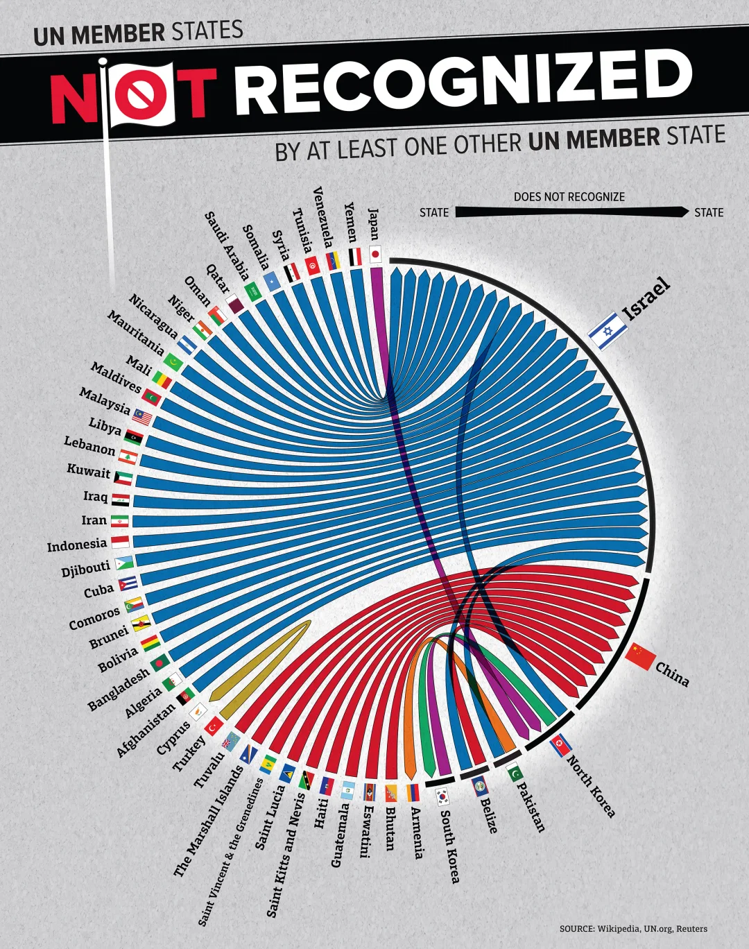
Infographics like this one are interesting. They’re cute to look at. But do they actually have value to you as a business owner?
The answer is a resounding YES.
Edward Tufte
Years ago, my sister introduced me to the work of Edward Tufte . Tufte is a very interesting guy who thinks a lot about the field of data visualization, how to portray information in a way that can be easily understood.
Here’s the challenge: when you have a confusing jumble of facts, or a lot of data, it’s hard for the human mind to grasp the bottom line. When we encounter a limited amount of information, we can process what it means. But when we are confronted with a huge amount of information all at once, it’s hard to make order out of it, and to figure out “so what?”
I’ve learned quite a bit from Tufte, and I used to have two of his coffee-table books. They include, as an example, this brilliant infographic by Megan Jaegerman that shows how to spot if someone is carrying a handgun (scroll down on the page to see it). In one infographic, she conveys what would probably be an entire chapter in a book.
Why Infographics Work
Here’s why infographics can be so effective:
-
They Simplify Complicated Ideas
They boil down statistics, Excel spreadsheets, or multi-step processes into pictures. They are fun to look at and easy to understand.
Useful for: explaining concepts like price savings, customer journeys, or industry trends.
-
They Grab Attention
People process visuals as fast as 150 milliseconds. Using infographics means you’re enabling your audience to comprehend your communication faster.
Useful for: news articles (that’s why I try to add pictures and videos to my own articles). For example, the Washington Post used data visualization to depict the relative locations of President Donald Trump, his would-be assassin, and the Secret Service countersnipers.
-
They Are Shareable
Infographics are among the most shared types of content.
Useful for: social media. If you’re posting on Linked In, for example, creating and posting an infographic makes it much more likely that your idea will be spread.
Here are seven common types of infographics (data visualization is #7):
Data Visualization – What Infographics Mean to You
All fine and well, but why does this matter?
Well, let’s think about this. Who is presenting information and trying valiantly to be understood? You. When you’re a business owner, you are communicating and hoping that you will be able to show:
- Why your service is superior to the competition
- Why your price is worth it
- Why your employees should follow your lead
- Why suppliers should sell to you
- Why the bank or venture capital or private equity firm should bet on your company
You need to convey information 一 and sometimes, visual aids are the best tool to get the message across. If you’ve ever used a spreadsheet, PowerPoint, brochure, or handout in a sales presentation or company meeting, then you’ve used visuals. You may think you are clear, but often, the information is actually obscuring your point. There are too many things happening at once. Too many numbers. Too much data. Too many supporting facts. You’re hiding the bottom line.
Here’s where the art and science of infographics comes to your aid. Data visualization allows you to show your audience what the point is 一 and make your point clearly and convincingly.
Therefore: look at any visual through the lens of the viewer. Will they be able to see through the numbers and pictures and understand my point? Is the takeaway obvious? Is there anything distracting here?
Keep refining until the “punch line” is unmistakable. Sometimes, you’ll be able to fix this yourself. Other times, it will be worthwhile to hire someone to amp up your visuals 一 or even to make infographics for you.
It’s not as crazy as you think. If you have a mountain of information, you can pay a designer to turn it into an infographic. And if you’re on a budget, you can hire a freelancer on Upwork or use AI tools to do it on the cheap.
Data visualization is real. If you’re communicating anything of any complexity, there’s a fair chance that you’re not being as clear as you want to be. Use the power of infographics and make your message unmissable.


